
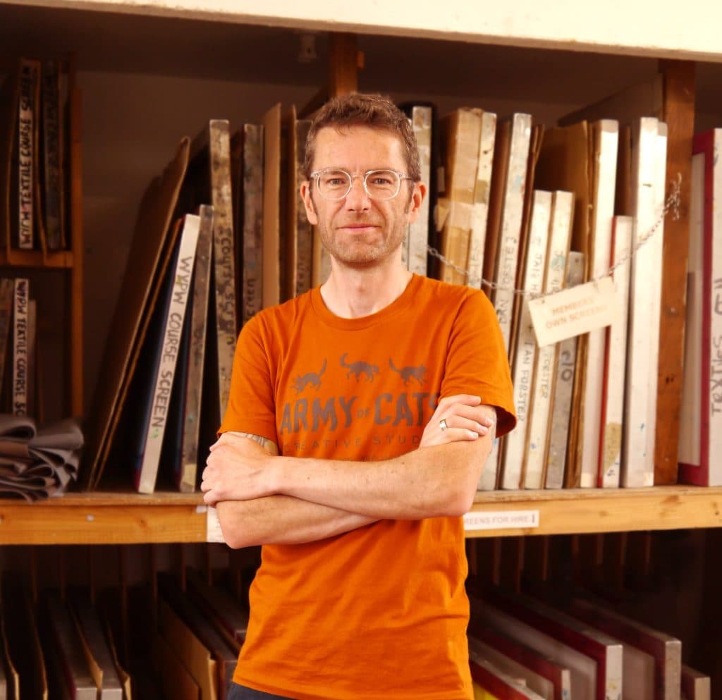
INTERVIEW: with Graham Pilling, Army of Cats Studio
by Threads Editorial
Arthur Schopenhauer said that all arts aspire to the condition of music, meaning that among the arts, music is all but alone in allowing the artist to appeal to their audience directly, without the intervention of a medium of communication in common use for other purposes. (Paraphrased from The Meaning of Art, by Herbert Read)
If the above is true, does it then follow that any visual stimuli that accompanies music is somehow inferior, a necessary tag-along?
Schopenhauer – and for much of his life, Read – could not have predicted either the LP or the merch stand, and certainly had no idea how tightly interwoven music and the visual arts would become during the 20th century.
Artists such as Roger Dean, Andy Warhol, and Storm Thorgerson would be tasked with creating icons, visual metaphors, even entire worlds to act as silent emissaries hoping to lure in just the right listener.
As daunting a responsibility as that may seem, it’s a familiar one to Graham Pilling, whose Army of Cats Studio has been producing album and poster designs for nearly 20 years.
Josefus Haze caught up with Graham to discuss his processes, inspirations, and personal journey as a professional creative.
You established yourself as Army of Cats Creative Studio back in 2006, but on your website, you allude to a lifetime of artistic output. When did you first make the connection between your visual art and the music of others?
I’ve always drawn and had a love of visual arts, but the music side of things actually came first.
Art was never something I was encouraged to pursue as a career, and I didn’t follow the usual route to university. I started college, taking Art as an A Level, but dropped out as I just wasn’t enjoying it and at that age, I simply had no idea what I actually wanted to do. I decided I may as well try and get a job (which coincidentally turned out to be in a typesetting and printing company, though I was just doing basic admin work).
My musical love at the time was punk rock. Initially all the second wave American stuff but going to gigs at the infamous Duchess of York over in Leeds meant exposure to lots of UK bands and the scene that surrounded them.
I loved the low-fi art and design work that adorned records, flyers and fanzines. It’s funny but the concept of ‘graphic design’ had previously never really clicked with me but all this stuff was DIY and scrappy enough that I could see how layout intersected with illustration.
I started to notice different individuals’ styles and see the names of people thanked for their art in record inlays. It felt like something I could do.
There was a small record label and mail-order distro in Leeds called Crackle Records. I’d order from them all the time and always received hand-written notes, flyers, and little catalogues with my orders. I drew up a few random illustrations and an advert for their label and just posted them off to them with a note saying, “use these if you like.”
They had never requested any artwork, of course, and I think they were initially a bit confused! The idea of any payment exchanging hands never entered my head, I just wanted to get involved, be one of those punks that makes artwork.
Some friends and I started a band, moved to Leeds and became more involved in what was going on musically there. This was late 90’s and it just seemed like the model lots of folk were following – a group of friends move out to Leeds from various neighbouring Northern towns to live in a crappy student house and start a band, label, or fanzine, or put on gigs – or all of the above.
Naturally, we started promoting our own gigs and so I took up the role of drawing and designing the flyers and posters. That was the beginning of my design education really, as I started to put myself in the shoes of the people who’d see the flyers – what will catch someone’s eye? What will stand out on the wall of other posters in the record shop? What references to the band or style of music can I drop in?
I started getting asked by other people to design posters and record artwork and it developed into something I was known for, eventually overshadowing me actually playing in a band. All that early work was very DIY, done for favours or beer money, and I was absolutely nowhere near making a living from my artwork. My skills were improving, though, and without really intending to I had built a modest little portfolio of design and illustration work.
It was far from an immediate transition into a full-time design career – there were plenty of unrelated jobs and other stepping stones on the way – but those early experiences definitely set me on the path to the work I do today.
You’ve produced work for theatre and television companies, but the majority of your output is focused on music and festivals. How much of this is do you attribute to the algorithms of life versus any conscious business manoeuvres on your part?
I’d say it’s something of a mixture of the two. I eventually got an actual design job as part of a team creating graphics for email marketing campaigns. I was only there for a year or so, but it improved my design skills, and I learned a lot from the folks I worked with.
Looking back, that could have easily been a turning point where I transitioned into a commercial graphic designer and stayed working in a studio environment. However, a couple of things occurred – firstly, I lost that job! Secondly, I discovered screen printed gig posters.
This will have been early 2000s. Though the screen-printed concert poster has its roots in 60’s counterculture and rock/psychedelia, it was enjoying something of a revival over in the US and I became an avid visitor of gigposters.com, a website which functioned as a repository and gallery of gig poster and flyer art (sadly now defunct).
I was completely obsessed with the artwork being shared and the opportunity to upload my own poster artwork and be a part of a much larger body of work. Being before social media, the members’ forums were super active with artists and printers sharing a seemingly endless amount of advice, technical knowledge, and in-jokes. My posters were still photocopied black and whites, but I became fascinated by the colours and process of screen printing.
The idea of artists getting together for a convention was suggested by the late, great Frank Kozik and thus the birth of the ‘Flatstock Poster Convention’ – an art market where poster artists could meet up, socialise, show and sell work. Flatstock became a regular fixture over in the US and began to be attached to music festivals like Pitchfork, Bumbershoot, and SXSW.
By this time there was a small group of UK regulars on the “geepee.com” site, which had become a really vibrant and exciting community to be a part of – even though at times for us Brits, we felt a bit like outsiders looking in – none of us were really screen printers at that point! It seemed like hardly anyone was in the UK, and it took us a little while to actually find printing facilities and learn the process.
It’s funny recollecting those times, actually, because screen printed posters as a collectible were just not widely understood by either bands or gig-goers here in the UK. Whereas nowadays it’s a staple on merch stands and peoples’ walls.
The momentum was building over in the States however and a group of US artists formed a professional body called the American Poster Institute. In 2006 they hosted the first European Flatstock event as part of the Reeperbahn Festival in Hamburg, and the call was put out for all the European artists to get together and attend.
I was still new to screen printing and had never done an event like it but I was determined to get involved and was just about organised enough to make it over to Germany to share a booth with my fellow artist pal Drew Millward.
I certainly wouldn’t call it a “conscious business manoeuvre” but that one event was hugely inspiring and certainly adjusted my career path so that screen printing posters became something I really wanted to be involved in.
I continued to do Flatstock events for a number of years – venturing as far afield as Barcelona and Austin, Texas. Working on improving my craft, making friends and contacts.
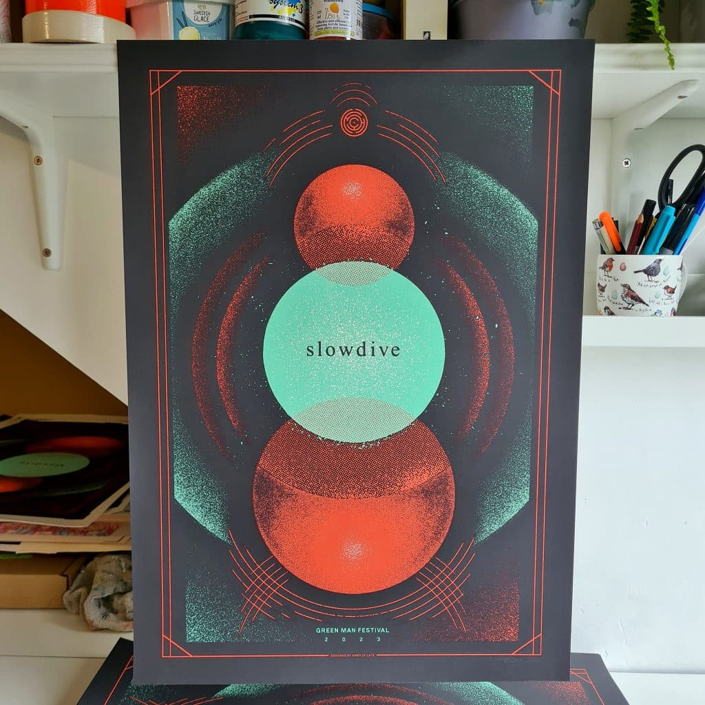
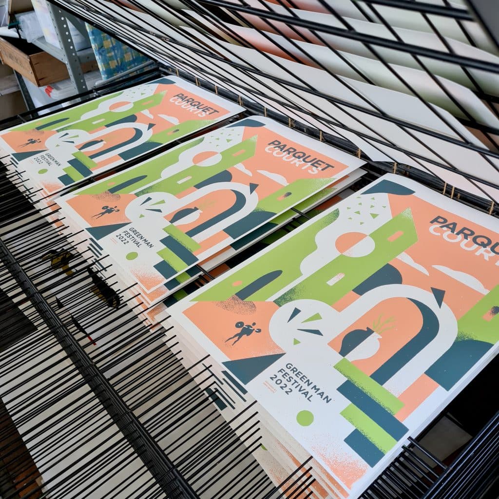
For the past decade or so I’ve teamed up with some good artist friends and we work together under the name UK Poster Association. We work at a few music festivals showing, selling, and creating gig posters as part of the event. (It’d be remiss of me not to mention those guys: Luke Drozd, Tommy Davidson-Hawley, and Chris White.)
Having a presence at music festivals is definitely a factor in continuing to get music-related work.
As well as the persistence and hard work of the individual, a certain amount of any artist’s career trajectory is dictated by time and place. What are the key differences between the current creative landscape and the world as it was when you started out on your artistic path?
When I was starting out there was this overarching belief that you had to move to London to get a design job. Technology and remote working tools mean I don’t think that is at all the case anymore (perhaps it never really was!).
The technological limitations of my early days, however, meant you were forced to interact with people to get certain things done – making telephone calls, going to a copy shop to get physical copies of work made, putting up posters or handing out flyers, etc.
It’s very convenient to do everything online now but you lose the value of making personal connections.
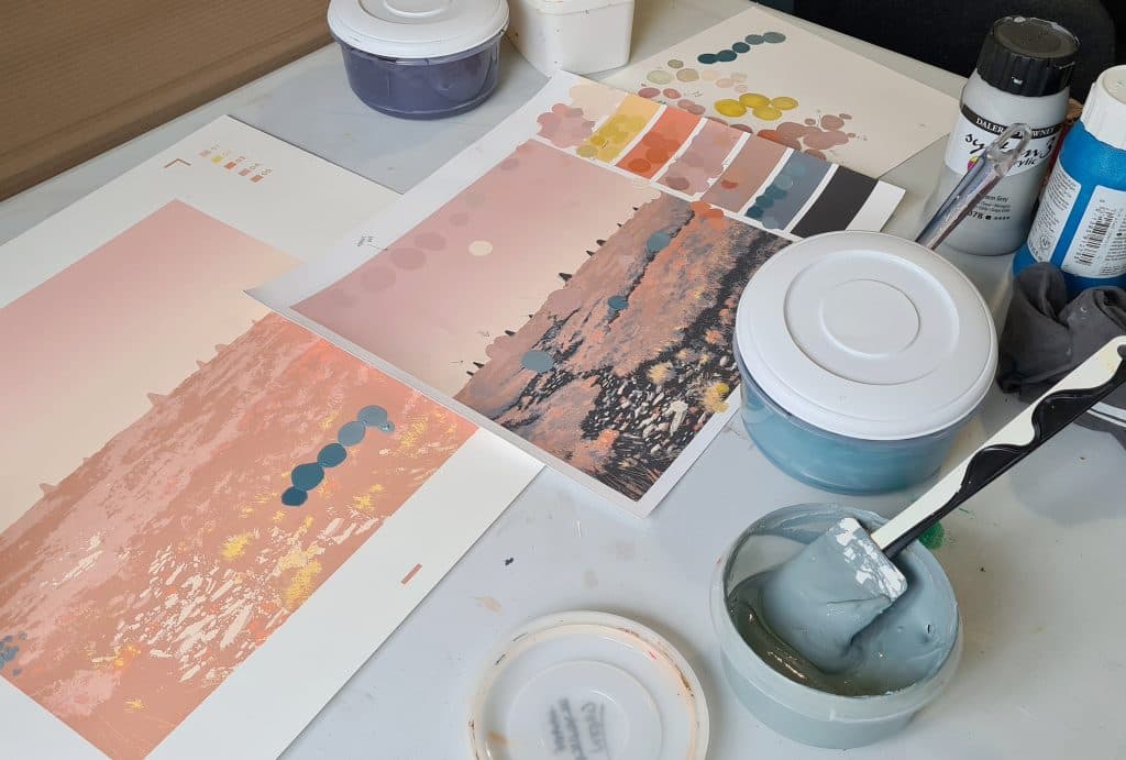
Would you share some insights into your creative process when creating artwork for albums and EPs?
I start out with a lot of notetaking, just bullet-point descriptive stuff that either the band provide as a starting point, or things that just immediately pop into my head – I’ve learned to listen to these little ideas that seem to appear out of nowhere, as sometimes there can be gold in there. I once said a random phrase off the top of my head when speaking to a festival director on the phone, and he was like, “wait what was that? I quite like that!” and it became the entire theme for that year’s event and which I then developed all the visuals for.
I tend to do a lot of little thumbnail sketches to try out a bunch of themes and compositions. Shape-design, and composition are really important, just making sure that the bare building blocks of a thing read correctly, or perhaps just look compelling to the viewer.
I share the first stage sketches with a client, sometimes making my own recommendations as the ones I think might be strongest. After some back and forth feedback, we usually identify a way forward and I then work on the final design. The amount of feedback and interaction is always different. Some briefs are pretty open, and others are more in-depth. For instance, with the band Public Service Broadcasting, each of their records has its own theme, so it’s important the artwork and packaging works together as part of the overall experience for the listener. It has more meaning than just nice visuals, so while it’s a lot more work, the record artwork I’ve done for those guys has been particularly satisfying.
Sometimes I just supply the cover art, and sometimes I do all the layout too and set up the files ready to be sent off to the pressing plant and printer. There is also often a bunch of promo art that goes with a release.
It is definitely one of the most satisfying things to be sent a copy of the final record, particularly when it’s on vinyl. I really haven’t done that many… but enough that they look nice together on a shelf.
You recently shared your latest work for PSB, album artwork for their forthcoming Amelia Earhart homage, The Last Flight. Working with a band that almost exclusively releases concept albums must mean that your output is at least partly determined by the predefined stylistic and thematic boundaries of each release. Has this given you the opportunity to work with artistic styles you might have otherwise overlooked?
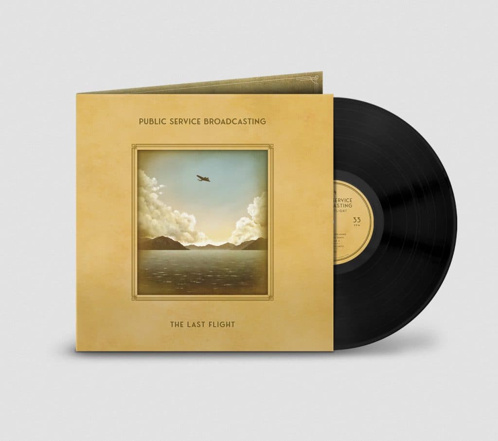
I’m fortunate in that I already had a pretty good feel for the vintage aesthetic that goes along with the work I’ve done for PSB, so I wouldn’t quite say I’ve had to completely learn a new style – but I have certainly had to develop some new techniques for ‘knocking the digital edges off’.
The LP booklet for The Last Flight is basically a scrapbook of notes and newspaper clippings, so I spent quite a bit of time coming up with different ways to make things look genuinely old and faded. There’s a sort of forgery aspect to it that I enjoy.
Due to the ‘horses for courses’ nature of designing to a brief, your work spans a number of stylistic boundaries. Given free reign, which style do you prefer?
I think artistic style is a really interesting thing, particularly the notion of “finding ones’ style”. When you’re early on in your artistic journey, there can be quite a strong desire to forcibly develop a trademark style to your work, but I think it’s a lot like handwriting – it evolves naturally, ultimately coming from repetition and all the little shortcuts you subconsciously take.
I like to think my fundamentals of designing and creating imagery are pretty sound, therefore I can apply any feasible visual aesthetic over the top. I like the challenge and variation of working that way. I actually like looking at other visual work and breaking it down, figuring it out — a recent LP cover I did references vintage sci-fi paperback book covers, for instance, so for that approach I look at those and almost reverse engineer the elements that most strongly read as that ‘style’ and then use my own toolkit to create something with the same feel.
Of course, even though I may reference another style on the surface, my own hand always shows through. So, in that sense I do think I have a style – though I really couldn’t say what my favourite style is. I enjoy the variation.
I’m definitely drawn to certain compositions though, and there are subject matter trends that show up – for instance with figures often being depicted small in scale within a large environment, or even with no human element at all. And texture is a big thing for me, probably born out of my early exposure to photocopied flyers and zines. Seeing work with a good grain to it, I don’t know, it’s like soothing white noise to me and I’m just drawn to it.
I had a friend once say he could really see my personality in my work, and particularly a sort of humour that came through. He couldn’t quite explain it but just felt it there. I took that as a huge compliment.
Of the artists and designers who’ve inspired you over the years, would you select one current and one bygone artist that are top of the list?
That’s a tough one! If I had a list, it would change every day. However, an artist who has been connected to some key moments for me would be Jay Ryan, an American musician and poster designer who produces work under the name ‘The Bird Machine’.
I encountered Jay’s work in the late 90s as he was creating posters for a lot of bands I was into at the time. I was struck by his contemporary style, everything hand-drawn right down to the text but with a joyful looseness – things like pencil sketch lines become part of the design. His subject matter is frequently anthropomorphic animals in absurd or interesting situations. A refreshing change to the usual big-boobed ladies draped over hot-rods of the psychedelic era.
I first met Jay when he came over to the UK for an exhibition of his work in Manchester. Me and some other artists went out for drinks afterwards and he was hugely warm, positive and encouraging. A few of us came away from that evening more determined than ever to pursue screen printing. We often joke that he single-handedly started the UK gig poster movement – but there’s also some truth to that.
I’ve exhibited work alongside Jay at Flatstock events quite a few times since then and, like many people I’ve shared a poster connection with, he is someone I now happily consider a friend.
As for a bygone artist someone that comes to mind right now is the late, great Colin Fulcher – better known as Barney Bubbles.
Barney designed a lot of album covers and other visuals in the 70s and 80s.
I’m a big Elvis Costello fan and when I first picked up a copy of This Year’s Model on vinyl, I noticed the cover looked misprinted – or rather offset, so some of the lettering was chopped off and the printers’ colour bar was showing. Wondering whether I had some rare misprint edition, I dug a little deeper to find that it was deliberately designed that way. The designer was Barney Bubbles.
I just loved the confidence of the decision. It was clearly to make the cover stand out and get peoples’ attention but that little gimmick, even decades later, also opened up the door for me to explore Barney’s work more extensively. I realised I’d been enjoying his work long before I ever knew his name.
He’s responsible for lots of great airbrushed designs for Hawkwind, most of the Attractions-era Costello records, work for Damned, and Ian Dury & The Blockheads. Even a classic logo for Strongbow Cider.
His work is expressive and varied, ranging from brutalist, Swiss-looking angular design work, to very free, paint-splattered and textural pieces.
The energetic but erratic aspect of his work perhaps makes sense as sadly he suffered with manic depression and committed suicide, aged 41. Absolutely tragic.
There’s a great book collecting his work which I find really inspiring – particularly as someone who also doesn’t really stick to one specific style. I just love a lot of the decision making. Just really simple and bold when the visuals call for it. I think it really holds up today.
You’ve clearly worked hard to establish yourself as a design studio. What advice would you give to anyone who’s just starting out?
Well, every path is different, so it doesn’t do well to get too caught up in trying to follow someone else’s road map. You can’t wait to be handed things, you have to make your own opportunities and connections – which is both easier and tougher than ever. With our connected world, we’re also increasingly more disconnected; there is more noise and competition for attention.
If someone is wanting to create artwork in connection to music, I think there’s value in finding some sort of scene to be involved in at the ground level. Starting small and building from there, making connections with bands, labels, promoters… Talk to people, make stuff, be positive, and figure it out as you go.
There’s also real benefit in collaborating with other artists. I know with my own UKPA group, we’ve achieved things collectively we couldn’t do as individuals.
Do you have a dream commission?
I’ve been fortunate to hit a few milestones where I’ve done poster work for a band and thought “whoa! Never thought I’d be doing work for them”, so from a professional (and financial!) point of view, I’d really like that trend to continue. It would be great to work with some of the bigger bands who have an established poster collector following, and a budget where I could push to do something quite ambitious.
From a personal point of view, though, I’d love to do poster work for some favourite bands of my early punk days. It’d be great to do something for Green Day in a Lookout Records era style, or for the band Jawbreaker.
by Josefus Haze
Editor: Alex H Honey
Back to home.